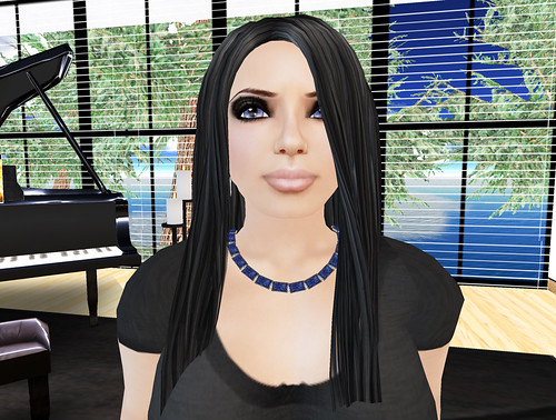
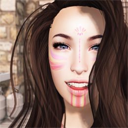
I was contacted by a friend to make an AO for larger avatars, and - I took on her challenge. :D She even supplied me with her own shape to use for this project. So, I've been working on that for the past few days. And well, I finished it already! I'm so excited about it, and I think it turned out great. Yay for teaser images!
Its similar to my Casual Girl AO that was just released, only slightly different poses and, well, made for larger girls. ^^ I had originally made it with priority 3 poses, which blocks out the typing animation. I personally don't like the typing animation, so it didn't bother me at all. But, I forgot others like it - including the person this was made for. XD So, I quickly reupped the 5 stands to priority 2. And now, this AO will come with two versions: Priority 2, and Priority 3. :D
I've stayed quiet for the whole "Obese Avatar/Skinny Avatar" thing that hit the blogs not too long ago, because blog drama is totally not my thing. However, I did want to point out here how beautiful her shape is. I changed her shape's face a little bit, because I planned on using it for my ad's as well. I didn't want to be a clone of her or something. I put a Chai skin on her, which I looooove so much, and I think it looks absolutely amazing. ^^ I have my ads almost done for this AO now. It will be free, right on top of my free Casual Girl AO. :D
Speaking of - I've been asked tons of times how long my Casual Girl AO was going to remain free. My answer: FOREVA! I wonder though, is it really so weird for someone to offer a Free AO? O.o;
Imperial Elegance is going through a few tiny changes as well. I'm trying to label the areas with tags such as "Free Items", "Poses", "Couple's Poses", "Furniture", but I've been having a nightmare of a time with it. I've tried sticking the labels on the walls: Ugly. Also, on the floor: Ugly. I just can't get anything to look right. I've also never been happy with the couple's poses wall - it seemed totally out of place.
Last night, I came up with this solution -suspended from the ceiling. Right now, I really like it. I think it blends nicely. However, I've been known to create something, wake up the next morning, and wonder wth I was thinking. So, we will try this for a while. ^^ As an added bonus for this - as I was playing with effects in PS for the signs, I actually found out how people did those amazing lighting effects that is quite common in some house textures. :D


August 3, 2008 at 3:36 AM
The signs look great, Sai! Your friend's shape is certainly beautiful. I haven't done anything to my shape ever since I fine-tuned it when I first joined SL... this makes me wonder if I should experiment ^^
August 8, 2008 at 3:45 PM
awwww *blush*
OH HAY!
Congrats on your partnership!!!!!!!!!
<33333
Post a Comment